5 Mistakes Churches Make With Their Sermon Series Design (And How to Fix Them)

Your Sermon Series is one of the most intentional things your church does. Weeks of study, prayer, and preparation go into it. But when Sunday morning arrives and the title slide goes up on screen — does it reflect that same level of care?
For many churches, the honest answer is no. Not because the team doesn’t care, but because design is often an afterthought, handed to a volunteer with a Canva free account and a tight deadline. The result is a graphic that technically works but doesn’t do the job it’s supposed to do: draw people in, set the tone, and make your series feel worth showing up for.
Here are five of the most common sermon series design mistakes — and what to do instead.
1. Using a Generic Stock Photo With Text Dropped On Top

This is the most common mistake by far. A worship leader grabs a cross-and-sky image from Unsplash, drops the series title on top in a default font, and calls it done. The problem isn’t the effort — it’s that this approach makes every series look the same as every other church’s series, and the same as last month’s.
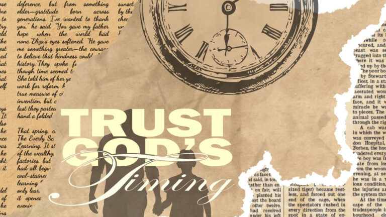
A sermon series graphic should feel like it belongs to that specific series. The image, the typography, the color palette — all of it should communicate the theme before anyone reads a single word. ‘Christ in Christmas’ should feel cinematic and sacred. ‘Trust God’s Timing’ should feel like tension and hope. Generic stock imagery with text overlay communicates neither.
What to do instead: Choose imagery that literally or conceptually illustrates the series theme. If you’re using AI image generation, write a prompt that describes the feeling and theology of the series, not just the title. Or work with a designer who understands the message.
2. Typography That Fights Itself
Mixing three or four different fonts in one graphic is a classic sign that no one made a deliberate typographic decision. Script font for the title, sans-serif for the subtitle, bold for the series number — each chosen separately without considering how they work together.
Strong sermon series graphics typically use two fonts maximum: one for the title (often a bold display font or high-contrast serif) and one for supporting text (a clean, readable secondary font). The contrast between the two is what creates visual interest — not cramming in variety.
What to do instead: Pick a type pairing and stick to it across every week of the series. Consistency is what makes a series feel like a system rather than a collection of one-off graphics.
3. Designing for One Format Only
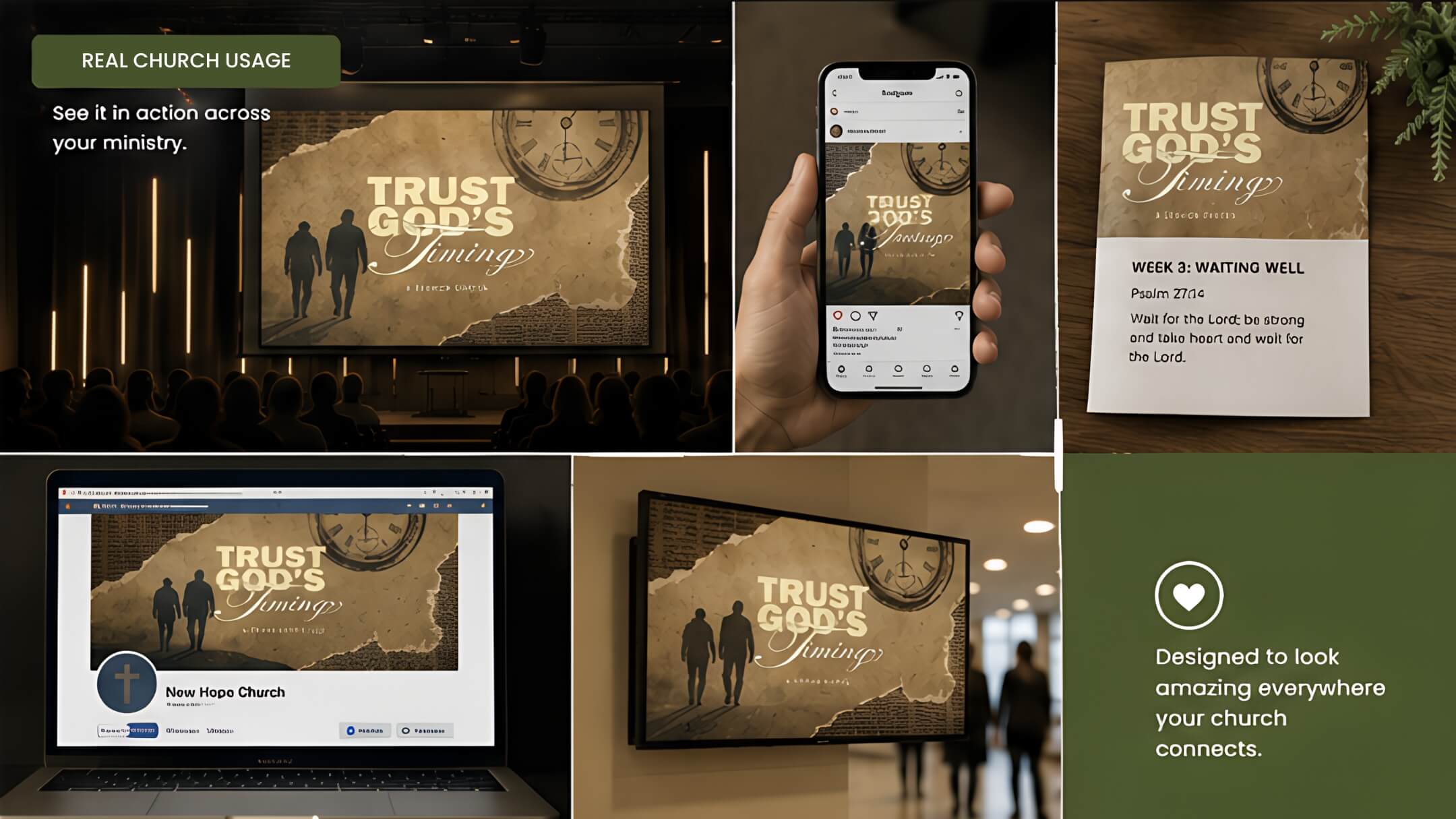
A sermon series graphic that only works as a 16:9 screen slide is only doing one job. Your church also needs an Instagram square for the feed, a story for vertical social, a Facebook cover for the event, and potentially a bulletin insert for print. If the original graphic was designed only for the wide screen format, adapting it to a square or portrait orientation often means the key text gets cut off or the composition breaks completely.
A well-designed series should be built as a system from the start — with the understanding that the same visual identity needs to translate across multiple formats and sizes without falling apart.
What to do instead: Before designing, list every format you need. A professional sermon series package accounts for all of these at once, so every deliverable feels like it belongs to the same family.
4. A New Look Every Single Week
Some churches swing to the other extreme — instead of one static graphic reused all series, they design something entirely new every week. This might feel like variety, but it actually works against you. Your congregation loses the visual continuity that ties each Sunday to the broader series arc. Regulars start to lose track of where they are in the series, and new visitors have no visual thread to follow.
What to do instead: Design a main series graphic that stays consistent throughout, then create weekly sub-graphics that share the same visual language (same fonts, same color palette, same general layout) but swap out the week’s specific title or scripture. This is what a proper editable Canva template makes possible — your team can update the week’s details without redesigning from scratch every Sunday.
5. Leaving It Until the Week Before
Design under pressure produces predictable results. When the series graphic is commissioned or started the week before launch, there’s no room for concept exploration, no time for revisions, and no opportunity to adapt the design across multiple formats properly. What gets used is whatever was ready in time — not necessarily what was best.
What to do instead: Treat your sermon series graphic like you treat your sermon preparation — start early. Aim to have your series graphics complete two to three weeks before the series launches so you have time to promote it on social media, update your bulletin templates, and ensure everything looks right across every platform.
The Bottom Line
Your sermon series graphic is often the first thing people see before they ever walk through your doors or click on your event. It’s worth getting right.
If your current process is producing graphics that feel generic, inconsistent, or rushed — it might be time to work with a designer who specialises in exactly this.
→ See our Sermon Series Graphics packages